Color Is Back in Style in Mountain Abodes
Color lovers, rejoice! Vivid hues are back in the world of interior design—welcome news after a very long run with trendy neutrals, followed by what felt like an eternity cohabiting with said tepid tones during quarantine. A colorful reset is in order, and Park City designers agree. Ahead, we’ve gathered tint tips from three local pros to help you move beyond beige. Their collective advice? Ignore the rules, embrace what you love, and experiment with colors and textures that boost your mood.
Get Personal
“For many people, there is a comfort level and safety in doing what everyone else is doing and having things look a certain way,” says Stephanie Hunt, interior designer and owner of design firm Flairhunter (flairhunter.com), whose colorful Instagram posts encourage the polar opposite of the neutral dwellings that have been popular in recent years. “I’m a crusader for having people do what makes them happy, and I try to cultivate surroundings that feel like a reflection of my clients.” She encourages spaces infused with personality—where the books, artwork, and knickknacks tell her something about you, whether that’s your collection of colorful vases or vintage concert posters. “Some of my favorite homes are the ones that are the most unique, cobbled together with décor from accessible stores and flea markets,” Hunt adds.
Start Small
Melissa Crotty, sole owner and principal designer of Root’d and Crotty Collaborative Design Group (ccdginteriors.com), suggests dipping your toe into the colorful design waters rather than diving in headfirst. Start with everyday objects in a favorite color, such as planters, picture frames, decorative trays, or vintage items, and place them in groups of three, or concentrate on a single item—a statement pillow, a welcome mat, or a book among other muted colors—in highly visible areas of your home.
Hunt adds that by starting small, you don’t have to commit to a potentially expensive makeover: “A lot of people are afraid of color not only because it may be a big change but because it can be costly.” In lieu of a new tile backsplash or repainting all of your walls, she recommends starting with simple, colorful changes like new throw pillows and linens or interesting art objects that are less permanent.
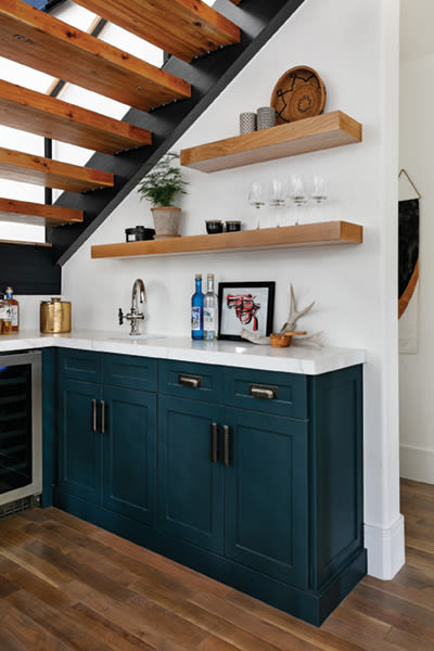
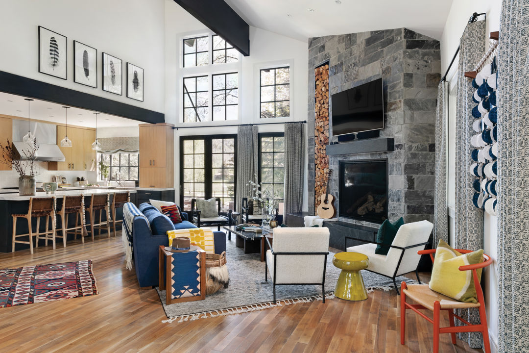
Stephanie Hunt of Flairhunter combined pops of color and a variety of textures in this Deer Valley abode she designed for a rock-star client.
Proceed with Confidence
The reason we gravitate toward one particular color over another is largely subjective, based on our experiences, memories, and distinct personalities. So, “if you love it, go for it,” encourages Crotty. While some colors you might choose to use more sparingly, don’t be afraid to go crazy with other beloved hues. Mad about red? Go rogue, and paint the walls in your office or dining room with the rouge tint. “I worked with a client years ago who said his only goal was to get a reaction,” recalls Crotty. “He wanted people to either love the end result or hate it, not just be fine with it. I love this philosophy. Our homes should reflect us and who we are, which will be drastically different for everyone.”
If you’d prefer to flex your colorful confidence in a more discreet way, Erin Price Proctor, principal designer of Erin Proctor Home (erinproctor.com), encourages her clients to pick something dramatic for the powder room. “Be bold and take a risk here,” she says, whether that’s bright paint or patterned wallpaper. “It will create a fun, unexpected experience for your guests.”
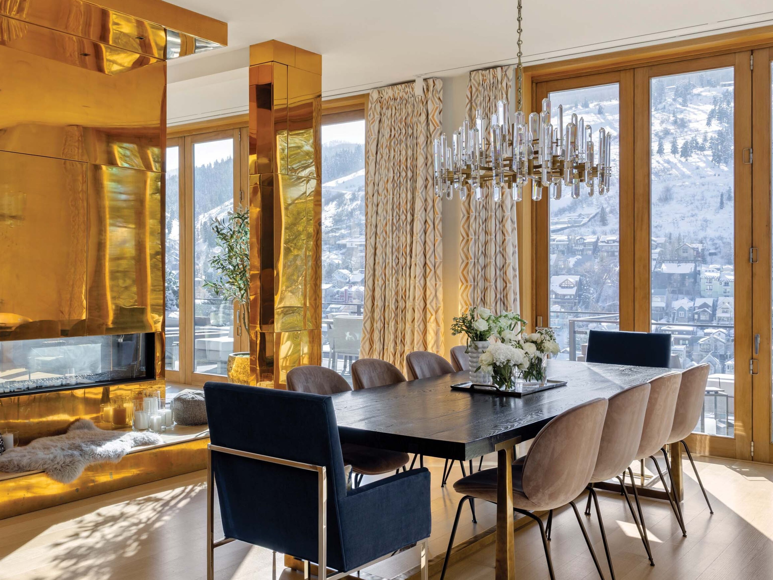
Go Green
We’re not talking about eco-friendly design here (although we’re fans of that, too), but rather about the verdant hue: saturated green tones are having a moment. Over the last several months, Proctor recalls an emerald green velvet couch, forest green leather stools, and moss grass-cloth wall coverings.
For Hunt, green is a universal color that works with everything. “Green brings a pop of life and color that doesn’t fight with anything,” she says. In a neutral room, she suggests adding a great pop of color with a lime green throw over your sofa or the foot of your bed, or by introducing a potted tree or adding a bowl of bright green Granny Smith apples in a ceramic dish to your counter.